Rewiring America.
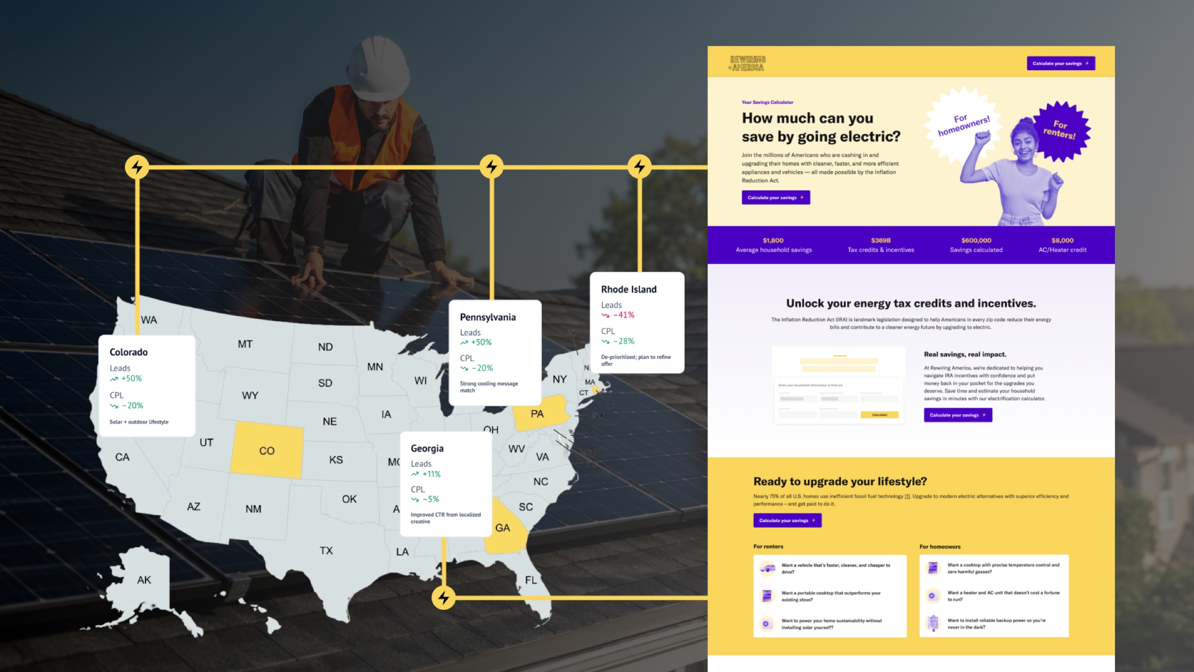
Four states.
One system.
Transforming a national lead-gen flow into a high-converting, state-aware landing system — built on a modular component library that scaled in three weeks.
High-quality traffic, weak conversion.
Rewiring America helps Americans electrify their homes by connecting them with incentives from the Inflation Reduction Act. Paid media was doing its job — driving high-quality, top-of-funnel traffic. The downstream experience wasn't keeping pace.
Visitors landed on a generic national homepage that lacked the educational clarity and trust signals to support a real decision. Strong intent. Weak conversion. The funnel was leaking exactly where the budget was hottest.
The problem.
Ad clicks were landing on a generic national homepage with no localized signals — no state context, no incentive math, no reason to trust.
-
01
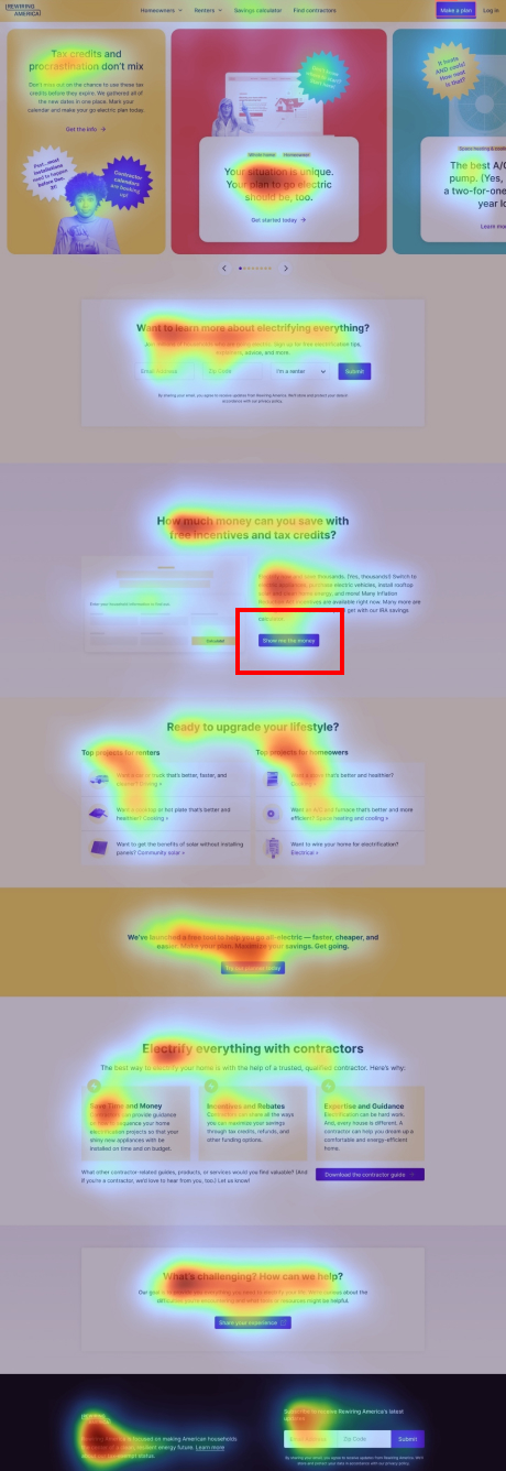
Calculator CTA buried below the fold
The strongest hook on the site wasn't visible without scrolling — qualified traffic bounced before ever seeing the offer.
-
02
Severe early drop-off
Email capture was losing qualified traffic before the form was reached. Strong intent, weak follow-through.
-
03
Generic by default
National copy and imagery was failing visitors who were thinking about their roof, in their state.

Only ~30% of homepage visitors reached the main CTA.
The calculator tool was the strongest hook but was buried too deep.
 Scroll ↓
"If we educate and build trust earlier in the page, users will feel more confident submitting their information — leading to more conversions and lower cost per lead."
Design hypothesis — discovery phase
Educate. Empower. Convert.
Two passes. First, fix the core landing experience — educate up front, build trust on the page, and put the calculator right in front of every CTA. Then localize across four states using a single component library — no per-state engineering.
Educate, build trust, embed the tool.
Before the redesign, every "Get my incentives" CTA punted users to a separate calculator page — adding a click between intent and action. We collapsed that gap: explain it, prove it, then let people use it right there.
- Added a 3-step explainer above the fold — Enter info → Review savings → Get support
- Embedded the incentives calculator directly on the page
- Anchored every CTA to the embedded tool — no jump to a separate calculator
- Front-loaded trust — privacy reassurance, partner logos, social proof
- Brought localized imagery and incentive math up high
- Added FAQs for the most common objections
- Re-ordered the page for mobile-first reading
Localize at scale.
One component library, four state variants. Each pulled from a controlled set of regional inputs — imagery, savings figures, utility names, testimonials. Zero per-state engineering.
- State-specific hero imagery and headlines
- Regional savings stats and utility logos
- Localized testimonials and trust signals
- Composable component blocks for fast variant builds
A 30-day cycle, on repeat.
To ship across four states without losing rigor, we ran a tight 30-day loop — repeated for every region after the first.
- 01Insights & hypothesis
- 02Message pivot
- 03Wireframes & specs
- 04High-fidelity design
- 05Dev alignment
- 06Multi-stack rollout
Four localized heroes, four regional messages.
Same chassis, four different conversations. Each variant pulled from the same component library with unique imagery, regional savings figures, and trust signals — and each was measured on its own.
 PA
PA
 GA
GA
 RI
RI
 CO
CO
All four states saw CPL reductions — PA and CO led at −20%. RI's lead volume decline prompted strategic budget reallocation.
Small change, big impact.
We tested whether requiring email upfront would hurt conversion. The data showed the opposite — visitors who committed an email were dramatically more qualified, and cost less to acquire.
Higher intent = better lead quality.
Lower friction, but a weaker signal.
−55% cost per commitment, +2× quality signal. Requiring email filtered for intent without meaningfully reducing volume.
Quantifiable results in 3 weeks.
Every key indicator improved on the same ad budget — and with 6% fewer clicks. Strategic UX moved the bottom line directly.
Connected surfacesThe redesigned page reads as one connected flow. Calculator and trust signals up top, the 3-step explainer right after, localized incentive math in the middle, and partner proof at the foot.
The win wasn't one big move — it was four sections doing the same job better. Click any tile to bring it forward.
| Metric | Old LP (Homepage) | New LP | Δ |
|---|---|---|---|
| Conversion rate (all) | 9.68% | 47.78% | +393% |
| CPL (all) | $26.55 | $5.93 | −77.7% |
| Submissions (with email) | 3 | 18 | +500% |
"Despite a 40% increase in ad spend, we saw a 15% decrease in cost per commitment QoQ — a clear win for the new experience."
Rewiring America — Marketing team
What I'd carry forward.
Trust isn't national — it's regional. The system that won wasn't a clever flow; it was a chassis that let one team have four different conversations with four different states without rebuilding the page four times.
Cross-channel team.
to align landing pages with paid ad messaging
to localize voice across four regional variants
on the modular component build and CMS rollout
on regional incentive accuracy and brand voice